

The Fishbone That Changed Everything
A human story behind the Ishikawa diagram
Have you ever sat in a meeting where something went wrong and everyone started pointing fingers? The machine broke, the supplier was late, the new guy made a mistake, and suddenly no one agrees on anything. An hour later, you still have no real answer. Just a room full of frustrated people and a problem that still needs fixing.
That feeling, that messy, circular blame game is exactly what Kaoru Ishikawa was trying to kill when he sat down and drew what the world would later call the fishbone diagram.
Japan, 1943. A Country Trying to Rebuild.
To understand why this diagram matters so much, you have to picture Japan in the early 1940s. The country’s factories were under tremendous pressure. Quality was inconsistent. Products were failing. And nobody really had a clear, structured way of figuring out why things kept going wrong.
Kaoru Ishikawa was a chemical engineer working with a team at Kawasaki Steel Works. He noticed that whenever a defect showed up, people would chase symptoms instead of causes. They’d fix one thing, and the problem would come back through a different door. It was exhausting and wasteful.
So in 1943, he did something simple but brilliant. He drew a diagram, a spine with branches coming off it, where every possible cause of a problem could be written down and grouped by category. It looked like the skeleton of a fish. And it worked. For the first time, teams could look at a problem together, from the same angle, without the conversation going in circles.
The Man Who Believed Workers Had the Answers
Dr. Kaoru Ishikawa was born in 1915 in Tokyo and spent most of his career at the University of Tokyo. He was deeply influenced by the quality movement happening around him, especially the ideas coming from American statistician W. Edwards Deming, but he took things in his own direction.
What made Ishikawa different was that he genuinely believed ordinary workers, not just managers or engineers, could solve the problems around them if they were given the right tools and the right environment. He wasn’t interested in top-down quality control. He wanted it to be everyone’s job.
He published the diagram formally in his 1968 book, Guide to Quality Control, and from there it spread first through Japanese industry, then to the rest of the world. He passed away in 1989, but the fishbone diagram he drew in a steel factory in 1943 is still being used in hospitals, tech companies, and classrooms every single day.
So How Does It Actually Work?
You start by writing the problem, the effect, on the right side of a page, like the head of a fish. Then you draw a horizontal line running left from it. That is your spine.
Off that spine, you draw diagonal branches. Each branch represents a category of possible causes. In manufacturing, people often use the 6Ms: Man, Machine, Method, Material, Measurement, and Environment. In services or healthcare, the categories might look a little different, but the idea is the same: you are grouping causes so nothing gets missed and nothing gets confused with something else.
From each of those branches, you keep asking “why?” and adding smaller branches for more specific causes. By the time you’re done, you have a complete pictur, not just one opinion, but every possible angle laid out in front of the whole team.
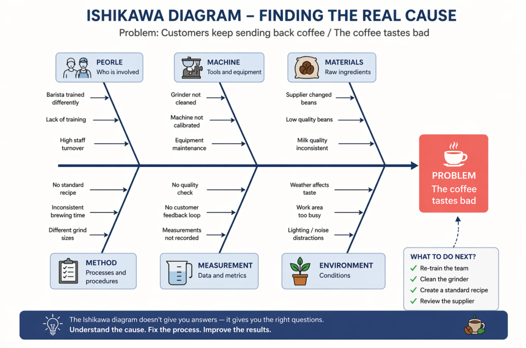
A Real Example: Why Is the Coffee Always Wrong?
Say you run a small café and customers keep sending back their coffee. The problem seems obvious, the coffee tastes bad. But is it really that simple?
You sit down and draw the fishbone. Under People, you notice your barista was trained differently from the rest of the team. Under Machine, you discover the coffee grinder hasn’t been cleaned in two weeks. Under Method, there is no standard recipe, everyone is guessing the measurements. Under Materials, you find out the supplier quietly switched to a different bean last month without telling anyone.
Suddenly, “the coffee tastes bad” becomes four separate, fixable problems. You retrain the team, clean the grinder, write down a standard recipe, and call the supplier. Within a week, the complaints stop.
That is what the Ishikawa diagram does. It does not give you answers; it gives you the right questions. And sometimes, that is all you need.
Still Relevant, All These Years Later
There is something refreshing about a tool that has survived eight decades without needing an update. The Ishikawa diagram is still one of the seven basic tools of quality control recognised by ISO, and it is taught in business schools, engineering programmes, and healthcare training around the world.
In a world obsessed with speed and technology, it is a quiet but powerful reminder that the best way to fix a problem is to truly understand it first. Slow down, draw the fish, and the solution usually finds you.