
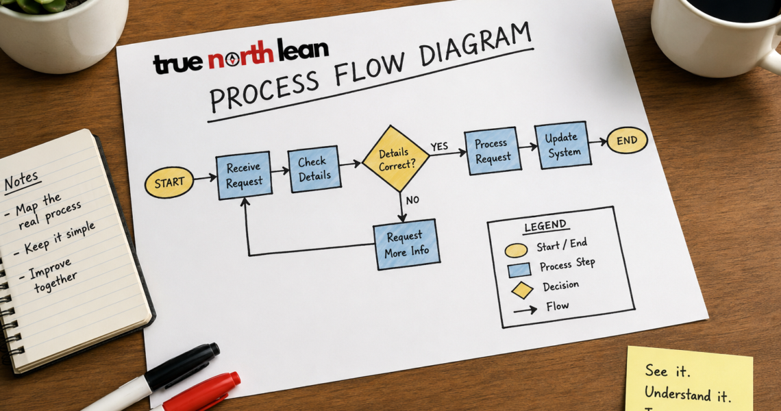
How to Draw a Process Flow Diagram Without Overthinking It
Most teams we work with already know their processes are messy. What they don’t always know is where the mess actually lives. A process flow diagram is one of the simplest ways to find out. You don’t need fancy software, a design background, or a six-week course. You just need a pen, a bit of patience, and the willingness to ask people how the work really gets done.
At True North Lean, we use process flow diagrams all the time, with garment factory supervisors, hospitality managers, NGO coordinators, finance teams and other organisations. The drawing itself is rarely the hard part. The thinking behind it is what makes the difference.
Here is the approach we usually recommend when someone is starting out.
Pick one process, not ten
Resist the urge to map everything. Choose one task with a clear beginning and a clear end. Something like:
- How a new hire gets their factory ID and PPE on day one
- How a customer complaint moves from the front desk to a resolution
- How a purchase order gets approved
- How a student enrols in a training programme
If you’re stuck, ask your team a simple question: which process do we get the most complaints, confusion, or rework about? Start there. That’s usually where the biggest gains are hiding.
Walk the process before you draw it
This is the step most people skip, and it’s the one that matters most. Go and see. In lean, we call it going to the gemba, the actual place where the work happens.
Talk to the people who do the task every day. Watch them do it. Try it yourself if you can. You’re looking for the real process, not the version written in the SOP binder that nobody reads.
While you observe, jot down:
- What the person actually does, step by step
- Where they pause, hesitate, or check with someone
- Which systems, forms, or tools they touch
- What decisions they have to make
- Where things tend to go wrong or get stuck
Small steps count. Waiting for an email approval is a step. Walking across the floor to get a signature is a step. These tiny gaps are often where waste hides.
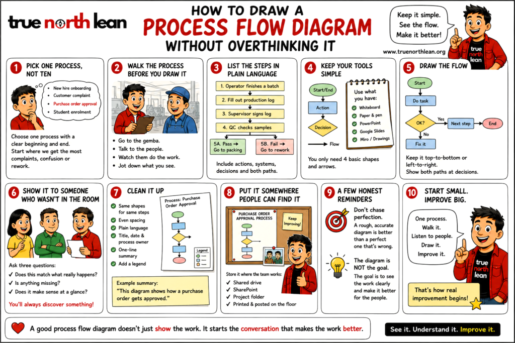
List the steps in plain language
Before you worry about shapes and arrows, just write the steps out in order. Sticky notes on a wall work beautifully for this, because you can rearrange them as you learn more. A simple notepad works too.
Include both the human actions and the system responses. For example:
- Operator finishes a batch
- Operator fills out the production log
- Supervisor signs the log
- Log goes to the QC desk
- QC checks samples
- If pass, batch moves to packing. If fail, batch goes to rework.
Make sure decision points are captured. Any moment where the path could go two ways needs to be visible on the map.
Keep your tools simple
You really do not need specialist software. Some of the best process maps we’ve seen at client sites were drawn with a marker on brown paper taped to the wall. Other workable options:
- A whiteboard
- PowerPoint or Google Slides
- Google Drawings, Lucidchart, or Miro if you want something digital and shareable
Stick to four basic shapes and you’ll be fine:
- Ovals for the start and end
- Rectangles for actions
- Diamonds for decisions
- Arrows to show what happens next
Clarity beats prettiness. Always.
Draw the flow
Now arrange your steps into a diagram. Most maps read well either top to bottom or left to right. Pick one direction and stay with it, because mixing directions confuses the reader.
When you hit a decision point, draw both paths. What happens if the answer is yes? What happens if it’s no? Both branches need somewhere to go.
If your diagram is starting to look like a plate of spaghetti, that’s a signal, not a failure. It usually means the process itself is too tangled to fit on one page, or that you’re trying to map several scenarios at once. Break it into smaller diagrams, one per scenario, and link them together. Your readers will thank you.
Show it to someone who wasn’t in the room
A process map only works if other people can read it. Once you have a draft, share it with:
- Someone who does the work every day
- Someone from a department that hands work to or receives work from this process
- A manager or stakeholder who owns the outcome
Ask them three questions. Does this match what really happens? Is anything missing? Does it make sense at a glance?
You’ll almost always discover something. A hidden approval. A workaround nobody documented. A step that only happens on Fridays. That’s the point of the review.
Clean it up
Once the content is right, tidy the visuals:
- Use the same shapes for the same kinds of steps
- Keep spacing even
- Label every step in plain language, not jargon
- Add a title, the date, and the name of the process owner
- Write a one-line summary at the top so a newcomer knows what they’re looking at
For example: “This diagram shows how a finished garment moves from the sewing line to the final packing area.”
If you’re sharing it widely, add a small legend explaining your shapes. Not everyone has seen a flow diagram before.
Put it somewhere people can find it
A diagram that lives on your laptop helps no one. Store it where the team actually works, whether that’s SharePoint, a shared drive, a project folder, or printed and pinned next to the line. If it’s part of a bigger improvement effort, keep it alongside the related standard work sheets, problem-solving boards, or kaizen records.
A few honest reminders
Don’t chase perfection. A rough, accurate diagram is far more useful than a polished one that hides the real problems. The first draft is for understanding. The next versions are for improving.
Also, remember why we draw these things in the first place. A process flow diagram is not the goal. The goal is to see the work clearly enough to make it better, easier, and safer for the people doing it every day. The diagram is just the tool that gets you there.
If you start with one process, walk it honestly, and listen to the people who live inside it, you’ll already be doing lean work, whether you call it that or not